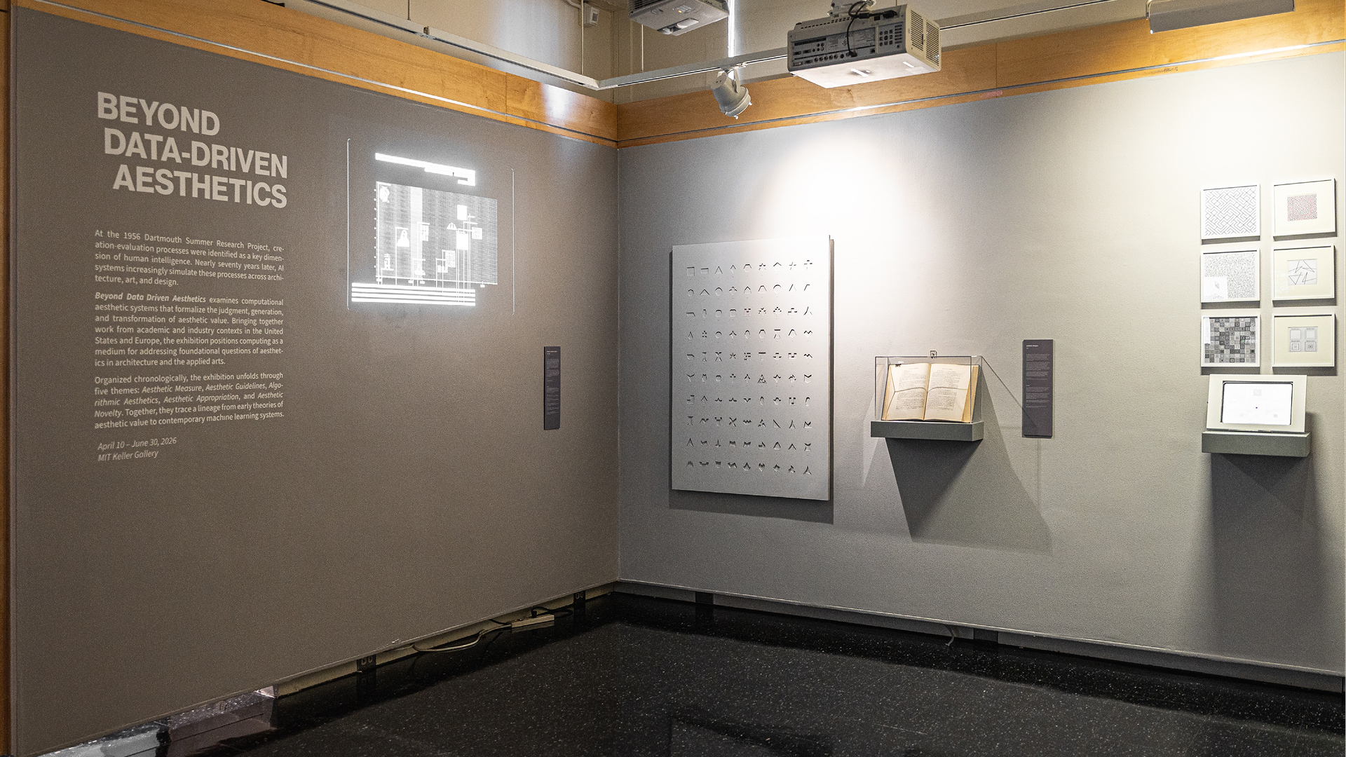
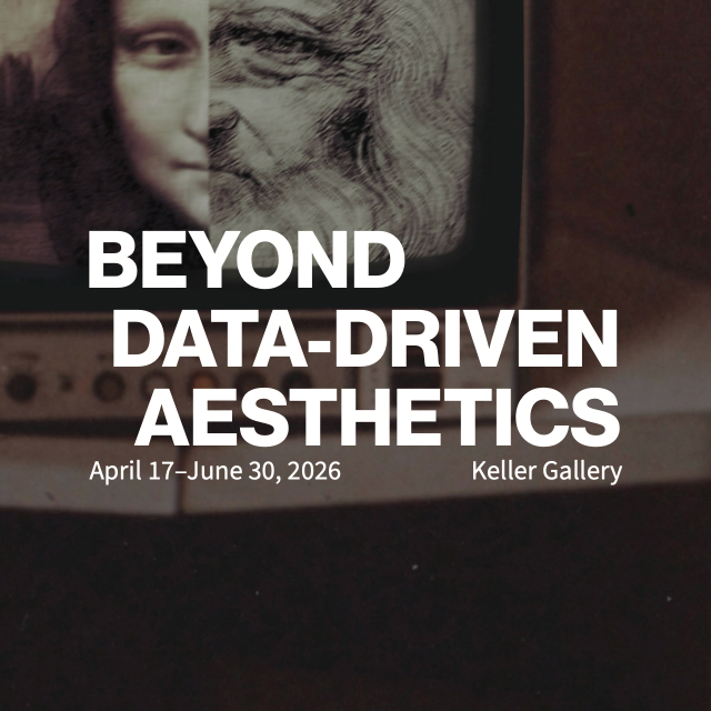
Simone Brauner. Your exhibition translates abstract models of aesthetic judgment into sensory experience. George D. Birkhoff's polygons become a sculpture with lighting that highlights exactly the boundary lines. Vera Molnár's guidelines become a tablet application that visitors execute themselves. Lillian F. Schwartz's morphing becomes a video monitor. How did you arrive at these curatorial decisions?
Alexandros Haridis. The approach of the exhibition is to ask what exactly in a particular research paper or book captures its most salient idea and then use design to interpret that idea in a visual, spatial, and experiential format. Drawing on design techniques such as software reconstruction, physical making, and data visualization, the exhibition takes written sources that are dense with algorithmic ideas, abstract concepts, and mathematical formulas, and translates them into stories in space that include interaction, material form, and digital visualization. How can we make the invisible/abstract in a paper or book into something that’s visible or tangible?
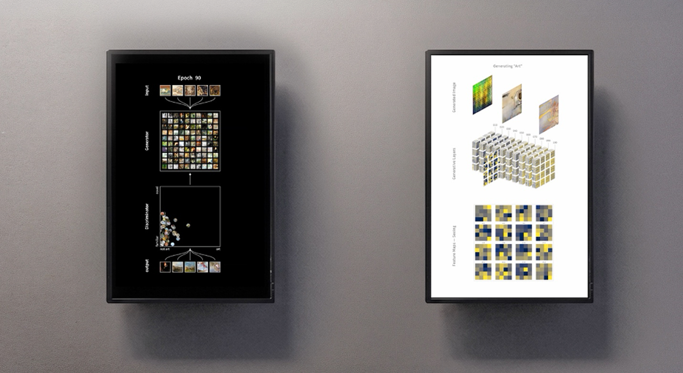
The case studies I selected for the exhibition are organized around five thematic areas: Aesthetic Measure, Aesthetic Guidelines, Algorithmic Aesthetics, Aesthetic Appropriation, and Aesthetic Novelty. Each theme functions as a selective “window” into a distinct computational approach to aesthetic judgment drawn from a specific publication—a book or research paper. The titles of these themes are derived from concepts central to each publication.
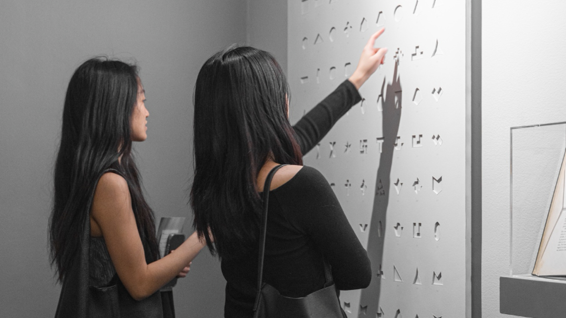
For example, “measure” refers to mathematician George Birkhoff’s 1933 publication of Aesthetic Measure (Harvard University Press), a key reference on formalist aesthetics of the 20th century. In Birkhoff’s system, aesthetic value is defined as a ratio between order (O) and complexity (C) in an object that belongs to a particular class, e.g., the class of polygons, class of ornaments, class of vases. The physical sculpture in Figure 2 is a wall-mounted relief presenting all 90 polygonal forms from Birkhoff’s original plates of the class of polygons in Aesthetic Measure (Birkhoff 1933, Chapter II). The polygons are manufactured as negative reliefs from a white substrate and arranged in a grid, ordered in terms of their aesthetic score—from highest (top left) to lowest (bottom right).
The subtractive, negative relief emphasizes the boundary lines of the polygons as physical edges that cast shadows under lighting, make viscerally present a key psychophysiological premise of Birkhoff's aesthetic measure: that the “effort of attention,” which is necessary for the act of perception, increases in proportion to the complexity C of the polygon; in this case the complexity is measured by the number of distinct lines that contain all sides of a polygon (Birkhoff 1933, 34). The easier a boundary is to trace visually, the simpler its shadow in the physical sculpture; the more irregular the polygon, the greater the perceptual effort.
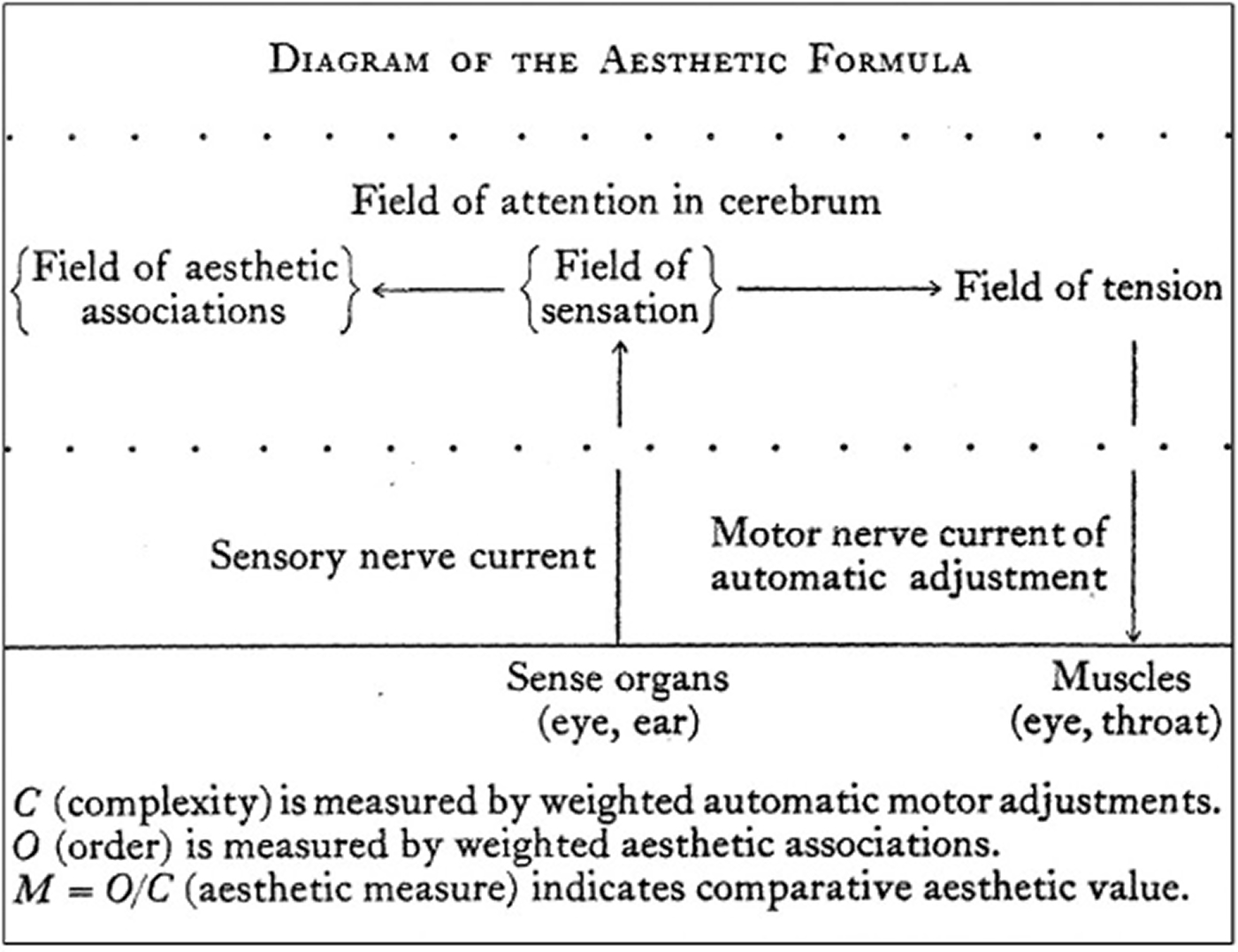
Figure 3: Diagram of Birkhoff’s formulation of the aesthetic experience in terms of automatic eye movements and correlative sensory input leading to his formula.
Alexandros Haridis. This embodied reading of complexity as attention was central to late 19th- and early 20th-century psychophysics and is illustrated in Birkhoff's own diagram in Figure 3 as the automatic adjustment of the eye traversing a polygon’s edges. This translation demonstrates how interpretive reconstruction can expose the perceptual assumptions embedded in a mathematical formula by materializing complexity as a measurable yet embodied experience.
I followed analogous interpretative approaches for the other case studies, too, choosing design techniques that represented key ideas in a publication in a meaningful way. One design technique that’s used in two case studies, in Vera Molnár (Aesthetic Guidelines) and Lillian Schwartz (Aesthetic Appropriation), is software reconstruction, a technique that researchers, scholars, and curators often use for reconstructing historic computer systems in formats accessible to contemporary audiences.
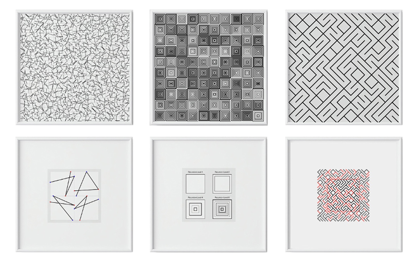
Figure 4: Six physical prints, framed, derived from algorithmic implementations of three of Molnár’s works. Each work is paired with its underlying procedure or guidelines. Photo: Beyond Data-Driven Aesthetics (2026).
Alexandros Haridis. In her article, “Toward Aesthetic Guidelines for Paintings with the Aid of a Computer” (Leonardo, 1975), Molnár describes how new works of art and design can emerge through procedures in which simple geometric shapes are successively altered into more elaborate arrangements—by hand or with the aid of digital computers. These procedures are computer-aided “guidelines”: step-by-step heuristics and numerical parameters that can be translated into code but also executed manually. The intention here was to allow visitors to use a digital pen and tablet that implements in a modern programming language the guidelines derived from three works by Molnár (Figure 4): (Dés)Ordres ((Dis) Orders) (1974), Quatre éléments distribués au hasard (1950), Signes sans Signification B (1975).
In an analogous way, I was interested in Lillian Schwartz’s article “Computers and appropriation art: the transformation of a work or idea for a new creation” (Leonardo, 1996). In this article sheexplores concepts of image and identity transformation that are quite common inthe visual arts, but she does so through early computer graphics techniques such as digital image morphing. Unlike rule-based abstract compositions, the works she describes show how aesthetic value can emerge by appropriating existing images from known artworks–such as Duchamp’s Nude Descending a Staircase or Leonardo da Vinci’s Mona Lisa–into novel yet recognizable forms.
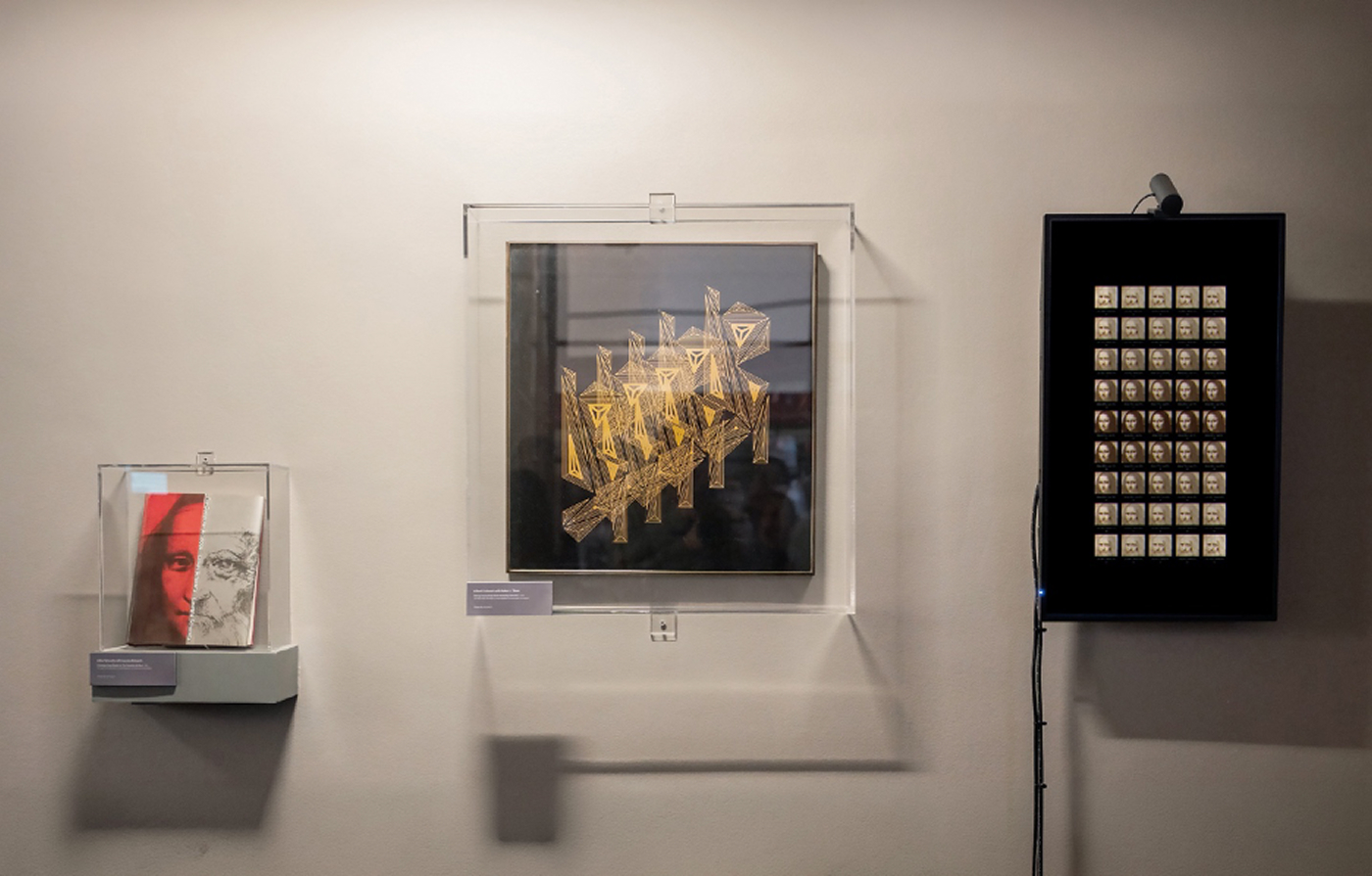
Figure 5: Two original works by Lillian F. Schwartz on loan from the Henry Ford Museum of American Innovation and a video monitor with a digital reconstruction of Schwartz’s “Mona-Leo” studies. Photo: Adrian Yu (2026).
Alexandros Haridis. In the exhibition, this particular technique is shown in two mediums: an original cover design for a book and a video monitor (Figure 5). The cover design is from ‘The Computer Art Book’ (c 1992), by Lillian Schwartz and Laurens R. Schwartz, which I obtained on loan from the Ford Museum of American Innovation. The video monitor reconstructs a computer-aided morphing algorithm that references the transformation of Isabella, Duchess of Aragon, into the Mona Lisa (c. 1503–1506), a process often associated with Da Vinci’s own facial features.
Also on display is second original piece I obtained on loan from the Henry Ford called Homage to Duchamp (Nude Ascending Staircase) (c 1975), by Lillian Schwartz with Robert J. Tatem. The framed painting shows a single static frame from a work that was initially conceived as a film.
More generally, across all five cases, the key insight is that design itself can make complex computational systems and abstract mathematical ideas visible and tangible. Whether through digital fabrication, software reconstruction, or data visualization, design can function as a method of interpretative translation. That is to say, a method of making visible, tangible, and experiential what traditional academic scholarship in technical domains typically communicates through words and word-like representational devices such as scientific diagrams and tables.